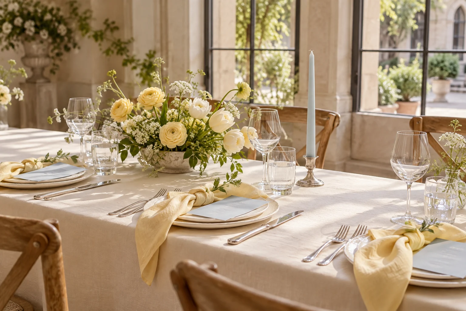
Butter yellow works best here as a gentle source of warmth. It does not need to become the tablecloth, flowers, dresses and cake all at once. For April, try it against powder blue and a warm white base. The contrast gives each color a purpose while keeping the room light. The exact shades below are our own wedding styling choices.
Make the yellow a deliberate choice
Compare a yellow napkin against the venue’s plate and cloth. Some creams will make it look brighter; others can make it disappear. Look in daylight and under the lights that will be used for dinner.
Choose one repeated yellow element and leave enough pale space around it. Blue paper details or a green stem can provide contrast without making the setting feel busy.
Let the outfit palette breathe
If yellow appears in the wedding party, share a clear range with fabric examples. Explain whether very pale cream is outside that range and let each person check a sample before committing.
Keep comfort and personal budgets in the conversation. A coordinated photograph is not worth an outfit someone cannot afford or does not feel comfortable wearing.
Test the whole place setting
Add the glass, cutlery, printed name and an approximate flower size to your sample. Look for places where one more color would add little. Often the room already supplies enough green or warm wood.
Save one photo and the actual samples for your suppliers. A short, consistent reference is easier to follow than several boards with different versions of yellow.