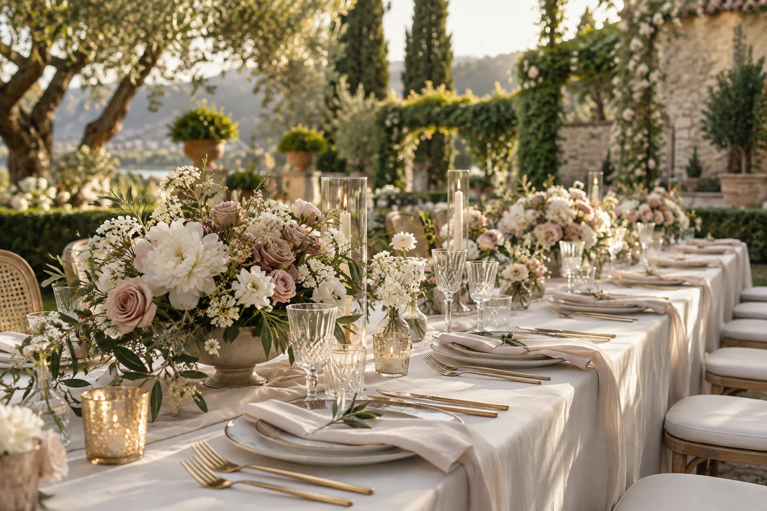
The garden feeling can start long before anyone reaches the venue. One illustrated stem on the stationery, repeated quietly on a menu, is enough to make the day feel connected. May’s edition favors soft rose, leafy green and a warm cream base. The aim is a small visual thread, not a new motif for every surface.
Choose the detail with a reason
Think of a plant from your venue, a favorite walk or the place you got engaged. Ask your stationer for an original illustration or artwork licensed for your use. Keep the shape simple enough to work at different sizes.
An illustrated flower does not promise that exact stem will be available on the day. Let the florist respond to the colors and movement, with alternatives suited to your location and date.
Give the information more room
Put the names, date and arrival details ahead of decoration. A small botanical corner can be enough on a place card. Leave clear space around type so a guest can read it quickly.
Order one printed proof on the actual paper. Check pale inks and fine lines, then test how the card stands or sits on the table.
Repeat less than you think
Use the motif at two or three moments that guests will notice. The invitation and dinner menu may already do enough. The rest of the room can rely on linen and real foliage.
Keep spare stationery quantities realistic and make a plan for late name changes. A beautiful design is more useful when it can accommodate the ordinary changes that happen before a wedding.